
- May 8, 2025
The Only Diagram Your Business People Understand
You’re in a kickoff meeting and the software architect proudly unveils a fancy diagram with 37 microservice, 5 databases, and enough boxes and arrows to recreate the Battle of Thermopylae.
Business stakeholders stare blankly, nodding along but clearly thinking about lunch. I’ve seen this movie too many times.
The first diagram any architect should show isn’t a maze of boxes – it’s a simple Use Cases Analysis diagram. Yes, the one with ovals that you probably last saw in a UML class. Before you roll your eyes, hear me out.
A use cases analysis diagram is a people-centric view of the system. It answers the fundamental questions, “Who will use this system, and what do they actually need from it?” No Kubernetes, no Kafka, no distributed systems complexity – just humans and their goals.
Start with People, Not Boxes
Your users are the “sources of change”. Each role is essentially a source of volatility.
If you design your architecture around what’s likely to be the source of change, you end up with a system that’s way more adaptable when the business inevitably says “Oh, by the way, now we need to support this use case…”. We call this design by volatility.
By mapping out who the users are and what they need, you create a shared understanding from day one. Business stakeholders see their concerns front and center. Everyone is on the same page about what the system is supposed to do before talking about how it’s built.
The 80/20 Rule: Focus on the Vital Few Use Cases
Now, you might say, “Sure, but users can do lots of things. How do we decide which use cases to put in this diagram without it blowing up into 50 ovals of chaos?” Good question.
This is where we invoke the Pareto Principle (80/20 rule). The 80/20 rule states that 80% of results come from 20% of efforts. That means 20% of the user actions likely account for 80% of the actual system usage. If that’s the case, it makes sense to identify the high-impact use cases – the vital few.
For each user role, ask: What are the top tasks this user spends most of their time on? Those will be your primary use cases.
If we’re talking about a banking app’s Retail Customer, they probably have dozens of features available, but 80% of the time they’re just viewing accounts, transferring funds, or paying bills. Bingo!
Those are the use cases to put front and center. By focusing on the critical 20%, your diagram stays lean, and you’re prioritizing what really matters.
Now what do we do with these high-priority use cases once we’ve identified them? We treat them like gold. That means:
Write automated tests for these use cases. If 80% of your users’ time is on these, you can’t afford them to break.
Design them cleanly. These are the core scenarios; make them easy to change. Be diligent when code reviewing them.
Prioritize them in development. Deliver value early by tackling them first. Impress the business by nailing what most users care about, then iterate on the rest.
The remaining 20 features? They’re not forgotten, they’re just not stealing the spotlight. You’ll get to the “Export data to Excel 97” use case eventually.
Example – A Digital Bank’s Use Cases Analysis (Baseline)
Let’s see what all this theory looks like in practice. Imagine we’re designing a Digital Bank system from scratch.
Who are our main users? Let’s say: Retail Customer, System Admin, and Support Agent. These are our three distinct sources of change. Now, what does each of them need to do in our system?
The Retail Customer wants to View Accounts, Transfer Funds, and Pay Bills (sure, they might eventually do more, but these are their bread-and-butter tasks).
The System Admin needs to Manage Agents (user accounts, permissions, etc.), Configure Settings (system-level configs), and View Activities (audit logs or usage stats).
The Support Agent will View Customer Profile (to see what’s up with a user’s account), Reset Credentials (because people forget passwords, surprise!), and Escalate Support Tickets.
That’s it – nine use cases across three roles. Covering the majority of what the system needs to do at a high level.
It’s simple, it’s human-centric, and guess what? Any stakeholder, from the CTO to the head of customer service, can look at this and say “Yep, that about covers it” or raise questions if something’s missing.
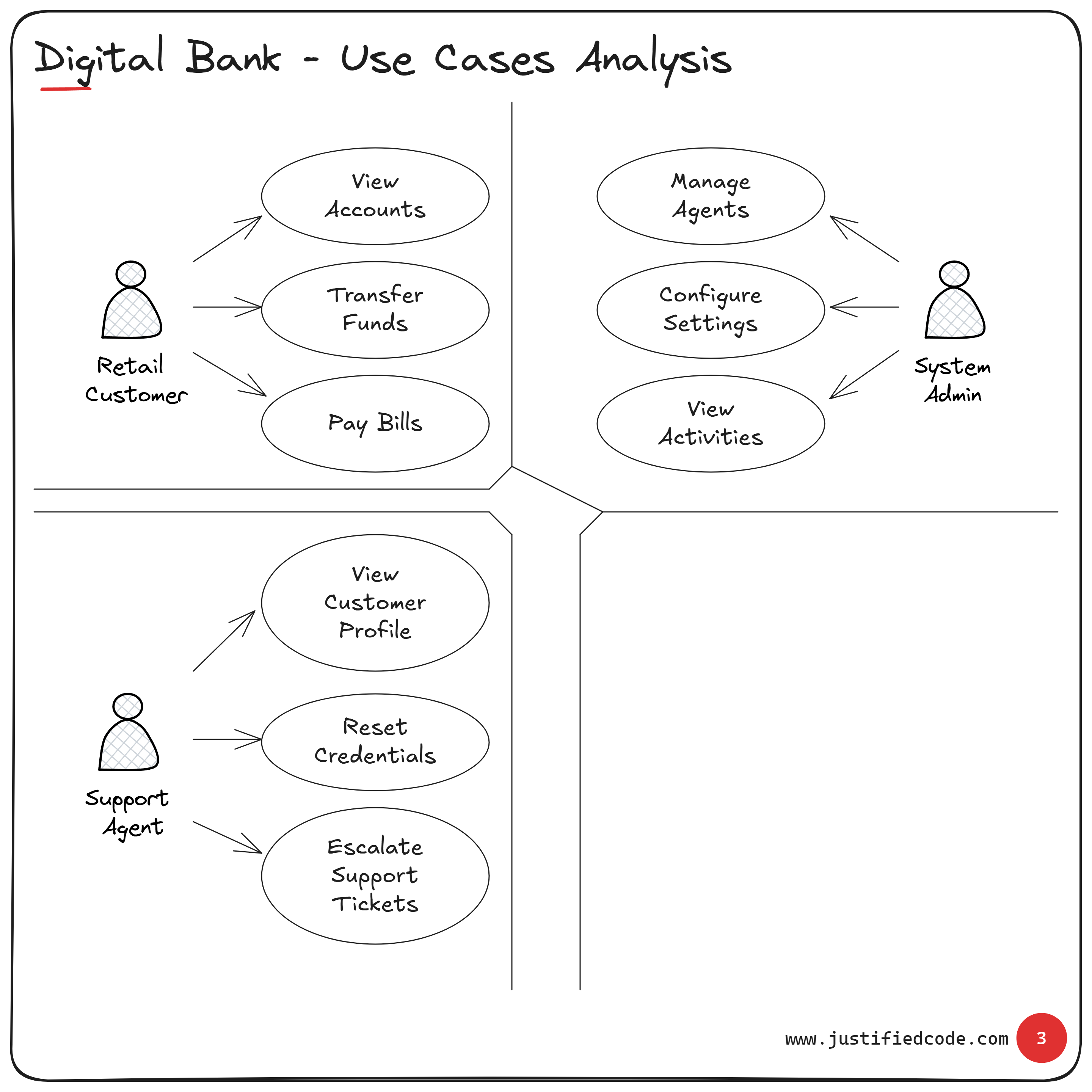
Figure 1: Baseline Use Cases Analysis for a Digital Bank.
The above diagram is instantly checkable by non-tech stakeholders. The head of retail banking can glance at the Retail Customer bubble and confirm those are indeed the key customer activities. The support team manager can validate that the Support Agent’s use cases cover their daily duties.
If something important is missing, it will jump out now – before we’ve sunk weeks into designing an API that nobody actually needs.
Extending the Model: New Role, No Drama
So the basic use cases model is done, stakeholders are nodding (for real this time), and everyone’s feeling good. Now fast forward: six months later, the business decides “We’re going to start serving corporate clients!”
How do we incorporate a brand new Corporate Customer role? We add another stick figure to our diagram and give them their own bubbles.
Corporate Customers have a different set of top tasks. Let’s say they need to Upload Payroll Files (to pay employees), Approve Payments (maybe a manager approves large transactions), and View Account Transactions in detail for accounting purposes.
Do these conflict with the Retail Customer’s use cases? Nope. Do they affect what the Support Agent or System Admin does? Not really. This new role is a new source of change.
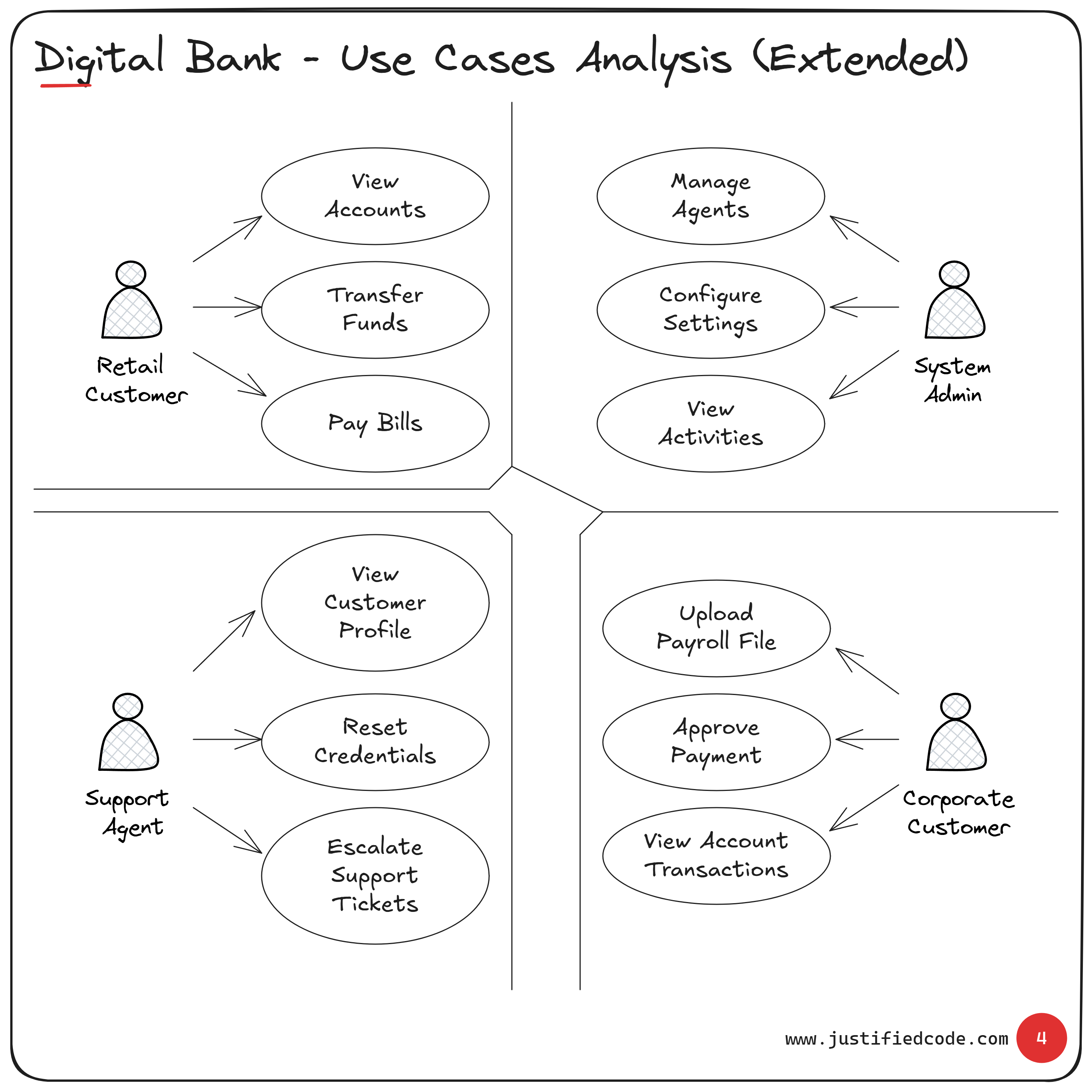
Figure 2: Extended Use Cases Analysis (adding a Corporate Customer)
If you show this updated diagram to a stakeholder, the reaction will be along the lines of, “Oh, I see, we’ve added corporate clients who can do these three extra things.”
Conclusion
It’s criminal how underrated the use cases diagram is in many organizations. We have entire meetings chasing microservice boundaries or debating Kafka vs. RabbitMQ, but we skip the one diagram that gets everyone to a common understanding.
A Use Cases Analysis diagram is the simplest, most powerful way to get aligned with business stakeholders from day one. Yet how many architects actually start with it?
When you start with it, you’re saying, “Let’s make sure we’re building the right thing, for the right people, before we figure out how to build it right.”
And if you ever get pushback like “This is too simplistic,” remind them that simplicity is the point.
So drop the 50-box diagram and draw me a simple picture of people and their goals. Trust me, that’s the diagram everyone will actually remember.
Related Courses
Master the architect mindset and communication skills through real digital banking diagrams. See how i tailor diagrams for business people, devops, tech leads, and developers. Digital Bank Architecture: Think & Communicate Like an Architect